
Clarifying Search
A User-Interface Framework for
Text Searches
Ben Shneiderman
Department of Computer Science and Human-Computer Interaction Laboratory
University of Maryland
College Park, MD 20742
[email protected]
Don Byrd and W. Bruce Croft
Center for Intelligent Information Retrieval
University of
Massachusetts
Amherst, MA 01003
dbyrd,[email protected]
D-Lib Magazine, January 1997
ISSN 1082-9873

Abstract: Current user interfaces for textual database searching leave much to be desired:
individually, they are often confusing, and as a group, they are seriously inconsistent. We propose a four-
phase framework for user-interface design: the framework provides common structure and terminology for
searching while preserving the distinct features of individual collections and search mechanisms. Users will
benefit from faster learning, increased comprehension, and better control, leading to more effective searches
and higher satisfaction.
[Note added at the request of the Authors, January 15, 1997. The Library of Congress has recently
improved the interface that we were using in Case Study 1 as the "before" example. We are
pleased with their improvements, but the advantages of our "after"
example are now less striking. We hope others will also improve
their interfaces as a result of this article.]
Introduction
The problem. We believe that an opportunity exists to improve user interfaces for textual
database searching dramatically. The ideal user interface is as simple as possible, and it makes key features
as clear as possible. But many of the current text-search interfaces -- especially on the World Wide Web --
are neither simple nor clear: they are often needlessly complex, and they very often obscure key features.
The result is confusion, frustration, and failure for intermediate and advanced users as well as novices.
Zero-hit outcomes occur on 30% of searches at some services, while huge numbers of hits distract users in
many other cases. While online search services such as
Infoseek,
AltaVista,
Lycos,
WebCrawler, and
Open Text are widely used, public and professional concern
about the difficulty of finding information is great (Flynn, 1995; Hatlestad, 1996; Somerson, 1996). But we
believe that improved designs can lead to a far greater number of positive outcomes. Recent studies appear
to confirm that when users are given more information on and control over their searches, their performance
and satisfaction increases (Koenemann and Belkin, 1996).
Improved user-interface design is clearly part of the solution; yet design has its own set of challenges.
Consider the diversity of the user community a broadly accessible resource like the Web proposes to serve.
One of the main sources of diversity, though by no means the only one, is differences in experience among
users (Shneiderman, 1992):
First-time users need an overview to understand the range of services. . .plus buttons to select actions.
Intermittent users need an orderly structure, familiar landmarks, reversibility, and safety during exploration.
Frequent users demand shortcuts or macros to speed repeated tasks and extensive services to satisfy their
varied needs.
Poor user-interface designs can be improved. But even then, as users move from one search service to
another, inconsistencies can cause slower performance, uncertainty, mistaken assumptions, and failures to
find relevant documents. For example, the search string "Hall effect" could produce (among
many other possibilities) a:
- search on the exact string "Hall effect"
- case-insensitive search on the string "hall effect"
- probabilistic search for "Hall" and "effect"
- probabilistic search for "Hall" and "effect", with higher weights if
"Hall" and "effect" are in close proximity
- error message indicating missing AND/OR or other operators/delimiters
- Boolean search on "Hall" AND "effect"
- Boolean search on "Hall" OR "effect"
Many existing systems give little or no indication of which interpretation they are using. Nor does the
above list hint at all the query-processing transformations in common use: there are also questions of
stemming,
stop words, relative weights of fields, etc. Finally, in many systems the
results are displayed in a relevance ranking whose meaning is a mystery to many users (and sometimes a
proprietary secret).
The suggestions given here are designed to be complementary to ongoing research in information
retrieval interfaces and visualization. See, for example, Rao et al (1995), Shneiderman (1994), and
Van House et al (1996), as well as various papers in
the annual ACM SIGIR proceedings (ACM).
Towards a Solution. Based on experience with many systems (Shneiderman, 1992) as well as
recent efforts with the Library of Congress's
THOMAS
(Croft, Cook and Wilder, 1995) and
American Memory projects, we
propose a four-phase framework for thinking about text-search user interfaces. We expect the framework to
be of interest to information retrieval specialists who are concerned about user interfaces. Note, however,
that this paper addresses only interfaces for finding information by searching. Browsing -- of indices,
alphabetical lists of terms, news articles, etc. -- may be equally important in some applications, but it has its
own set of challenges.
Admittedly, user-interface differences sometimes result from functionality differences: no Boolean
system (in the usual sense of the term) can do probabilistic searches. Nonetheless, inconsistencies can and
should be reduced greatly, and those that remain can and should be made clear. The basic automobile user
interface is something we now take for granted, but it took many strange meanders over several decades to
reach this level of standardization (Oliver and Berkebile, 1968; Buxton, 1989); and remaining
inconsistencies like left/right variations from country to country still cause serious problems for travelers.
As software designers, we should be able to do much better than we are doing now, and thereby to spare our
users millions of conceptual fatalities.
In the remainder of this paper, we outline the four phases; make recommendations as to how to
implement the phases, based on the user's perspective; and show how two existing systems (one Web-based,
one standalone) could be redesigned in accordance with our recommendations. We believe that designers
armed with this information will be in a good position to satisfy the needs of all users, both in standalone
situations and over networks including the World Wide Web.
The four-phase framework for search
The four-phase search process gives great freedom to designers of specific systems to offer a variety of
features in an orderly and consistent framework. The phases are:
formulation (what happens before the user starts a search);
action (starting the search);
review of results (what the user sees resulting from the search); and
refinement (what happens after review of results and before the user goes
back to formulation with the same
information need).
Actually, before performing a search, users must consider their information need and clarify their search
goals. But this is just what a computer system cannot help with.
1. Formulation: This is the most complex phase in that it involves decisions of several types,
each of which may itself be complex. These decisions include the sources of the search, i.e., where
to search; which fields of documents to search; what actual text to search for; and what
variants of that text to accept. Some systems actually walk the user through each of these decisions
in succession, but they cannot always be made in a predetermined order; nor are we convinced they
exhaustively cover the query-formulation possibilities.
a. Sources: The first step in performing a search is normally to decide where to search
(Marchionini, 1995). This is often a single physical database, but increasingly it is multiple and distributed
databases, accessed across a network.
Even if technically and economically feasible, searching all libraries or all collections in a library is
frequently not the preferred decision. When users are confident they know where the truly relevant material
is, they often prefer to limit the scope of their searches to a specific library (say, NASA, Princeton, or the
DIALOG system), a specific collection in a library, or a specific range of documents in a collection.
In most cases, users decide "by inspection" where to search. However, this decision can
also be made by an instance of exactly the same procedure as the final search. Specifically, some systems
support a process called "collection selection", in which the user's query is run against a special
database that describes the contents of all known databases (Callan et al, 1995). The result, instead of a list
of best-matching documents, is a list of best-matching databases. The user can then run their query against
one or more databases in the list.
b. Fields: Each document in a collection may have multiple fields (sometimes called
attributes, components, or tags). Users may wish to limit their search to specific fields of documents within
a collection. For example, users searching on common terms might prefer to retrieve only documents whose
title contains that term, or at least to give a higher rank to documents whose title contains that term: see for
example the elaborate weighting algorithm used by THOMAS
(Croft, Cook, and Wilder, 1995).
Searches may also be restricted by structured fields (year of publication, volume number, language,
media type, publisher, etc.). For example, searchers in the Congressional Record may wish to restrict
searches to items involving a specific member of Congress.
c. What to search for: There are various ways to express what to search for in full text; the
most important are probably (1)
unstructured text, (2) text with embedded operators, and (3) text with
operators specified separately. Pure unstructured-text interfaces are unusual: most of the popular Web
search services
(AltaVista,
Infoseek,
Lycos etc.) and other systems such as
INQUERY accept either unstructured text or
text with embedded operators. An example of the latter is Infoseek's "city-guide +Boston" (the
words "city" and "guide" must appear in close proximity, and the word
"Boston" is required). Finally, Open Text's
Power Search uses text with separate
operators. All three ways can be effective, but only if they are used properly.
A key issue here is that of phrases. In many situations, especially with short queries, searches on
meaningful phrases are much more effective than searches on the words of the phrase. Using phrases will
generally increase
precision at the expense of
recall. For example, for someone searching for information on air pollution,
the phrase "air pollution" is likely to find fewer irrelevant documents (higher precision) than the
pair of words "air" and "pollution" -- though it will tend to overlook relevant
documents that refer to "air quality" or "atmospheric pollution" (lower recall). In
particular, phrases facilitate searching on names: for example, a search on "James Billington"
should not turn up "Jesse James". It should be easy for users to specify, and easy for them to
know if they have specified, that a series of words should be considered a phrase.
Unstructured text, approach (1), is often called "natural language", and indeed, it
looks like natural language, but this can be extremely misleading. For example, many systems treat
"and" and "not" as stop words. In such a system, the query "bees and not
honey" means the same thing as just "bees honey": compared to the query
"bees", it is more likely to retrieve information about honey, not less. Even if the system
pays attention to words like "and" and "not", it may parse a complex query
differently from the user's intention. Similarly, a user might well assume that semicolons between words will
be taken as an indication that the words are not part of a phrase, but
AltaVista has exactly the opposite interpretation. The only
real solution to this kind of ambiguity is with feedback informing users of how the system interpreted their
queries, but it is very difficult to give this kind of feedback in a way that will be clear to nontechnical
persons.
In theory, text with embedded operators, approach (2), can be completely unambiguous, including
specifying phrases; it can also specify fields. However, our experience has shown consistently that a great
many users will have trouble with this approach. One reason is lack of standardization: the syntax and
meaning of embedded operators vary considerably from one system to another, so it is easy to get confused.
For example, in Alta Vista advanced search and Yahoo!, a "wildcard" (matching anything) is
indicated with "*"; in Lycos, it's "$". In Infoseek, Magellan, and Yahoo!, "-
" preceding a word means it's forbidden, and "+" preceding a word means it's required; in
Lycos, "-" means forbidden, but there seems to be no way to mark a word as required. Another
problem is the danger of
inadvertent activation: innocently using text that the user thinks of as
unstructured, but which contains characters or strings that will be interpreted as embedded operators. For
example, some systems (WebCrawler and INQUERY among them) use parentheses to delimit phrases or
other groupings; in such a system, pasting in text containing parentheses might result in prematurely ending
a grouping.
Other than embedded operators, the only way we know of to specify phrases unambiguously is with an
implementation of approach (3), text with operators specified separately: the program considers the contents
of every text-entry box as a phrase, and clearly says so on the screen. Then multiple entry boxes must be
provided to allow for multiple phrases. (Of course, a text-entry box must also accept a single word.) If
choices of Boolean operations, proximity restrictions or other strategies for combining the boxes are
available, then users should be able to express them; regardless of whether any choices are available, users
must be told what combining technique is being used. Ideally, users and/or service providers should have
control over stop lists (common words, single letters, etc.); at a minimum, users should be warned when
they try to search for a
stop word.
The basic issue is always this: Does the program interpret the query the way the user intended it, and --
even if it does -- does the user know that the program interprets it that way? A significant advantage
of approach (3) is that, correctly implemented, it is probably the easiest for users to understand.
It is important to allow searching structured fields
(controlled-vocabulary text, dates, etc.) in databases that also contain
unstructured text at the same time as text fields are searched. The user-interface issues for specifying
"what to search for" in structured fields are the same as for standard database systems.
d. Variants: Users are very often unsure of the exact value of the field they want; indeed, there
may not be any single value that is appropriate. As a result, users may want variants to be accepted. In
structured fields of text databases, as in traditional databases, this may include a range on a numeric or date
field. In unstructured text fields, interfaces may allow user control over:
- capitalization (case sensitivity)
- stemmed versions: searching for "teach" finds words like "teacher",
"teaching", "teaches"
- partial matches: searching for "biology" retrieves "sociobiology" and
"astrobiology"
- phonetic variants, e.g., from N-grams or soundex-like methods: searching for "Johnson"
finds "Jonson", "Jansen", and "Johnston"
- synonyms: searching for "cancer" finds "malignant tumor"
- abbreviations/acronyms: searching for "Digital Equipment Corporation" finds
"DEC"
- broader or narrower terms from a thesaurus (searching for "New England" finds
"Vermont", "Maine", "Rhode Island", "New Hampshire",
"Massachusetts", and "Connecticut", and vice versa).
In addition, this item should include stop words. (Of course, the fact that some words are stopped has
nothing to do with variants in the normal sense.)
In all cases, the user interface should make it clear how variants are handled.
2. Action: Searches may be started explicitly or implicitly. The typical usage process in
current systems is to have users click on a Search button to initiate the search and then wait for the results.
But a very appealing alternative is that of "dynamic queries": there is no Search button but the
result set is continuously displayed and updated as phases of the search are changed. See, for example, the
commercial system
Folio Viewer, or research prototypes like Ahlberg and
Shneiderman (1994) or Shneiderman (1994). This approach requires adequate screen space and high
bandwidth, plus, for a large database, very rapid processing: whether it is feasible depends very much on the
situation. However, when it is practical, the advantages are great: users can broaden, narrow, or refocus
their search several times in as many seconds. Designers may also allow users to choose between
approaches.
In situations where it is not practical to re-run the query and update results continuously -- for example,
when the database and the user are connected by a network with limited bandwidth -- the "query
preview" approach is worth considering (Doan et al, 1996). In this approach, changes to the query
simply update a display (perhaps just an estimate) of the number of hits. The query is not actually re-run
until the user requests the full results, presumably when they are satisfied that the number of hits is neither
zero nor so high as to be cumbersome. However, it is not yet clear how such an approach can be applied to
full-text information retrieval.
A final comment: users should have an obvious way to stop the search in case they feel it is taking too
long. Most if not all popular Web browsers have a Stop button, so this should not be an issue for Web
interfaces. In addition, many window systems have a standard way of doing this that does not rely on any
visible part of the user interface (henceforth "UI"), but less sophisticated users may not know
that or may not remember how to activate it. (One would hope that this function would rarely be needed in
dynamic-query systems, whose design response times must be very brief.) If the search interface includes
both Search and Stop buttons, they should be close together.
3. Review of results: For some time, information retrieval interfaces have let users specify
result set size (for example, a maximum of 100 documents), contents (which fields are displayed),
sequencing of documents (alphabetically, chronologically, relevance ranked, . . .), and, occasionally,
clustering (by field value, topics, . . .). All of these capabilities can be valuable, but they all simply try to
make a list of documents easier to handle. A query against a large database, even a query that is well
focused, can produce so many potentially-useful hits as to be overwhelming -- say, several hundred or more.
Fortunately, much more can be done to display results in a useful form.
Recent work in information retrieval interfaces, capitalizing on general information-visualization
research, has dramatically expanded the limited traditional palette of display techniques. For example,
LyberWorld
(Hemmje et al, 1994) displays document icons in a circle, with terms around the circumference
"pulling" the documents towards themselves; the terms can be moved and the strengths of their
pulls varied. Rao et al (1995) describes such techniques as tilebars, perspective walls, cone trees, and
document lenses. Swan and Allan (1996) discuss three-dimensional network displays, with the viewpoint
adjustable in real time, to support clustering. Finally, "virtual reality" flythroughs of simulated
document spaces are being explored intensively. For example, the Web page for Apple Computer's
HotSauce says "Download the HotSauce fly-through
plug-in to fly through 3D representations of Web space right away."
Search interfaces should also provide helpful messages to explain search results and to support
progressive refinement. For example, if a stop word or misspelling is eliminated from a search input
window, or stemmed terms, partial matches, or variant capitalizations are included, users should be made
aware of these changes to their query. If the two words in a phrase are not found proximally, then feedback
might be given about the occurrence of the words individually. If multiple phrases are being sought, then
perhaps documents containing all phrases should be shown first and identified, followed by documents
containing subsets, but if no documents are found with all phrases, this would be indicated. A fairly
elaborate decision tree (perhaps 50 to 100 branches) of search outcomes and messages might be
specified.
4. Refinement: One of the most important ways in which current information retrieval
technology supports refining searches is
relevance feedback. A search interface can support relevance feedback in a
variety of ways. Koenemann and Belkin (1996) describe a user test of several ways, and suggests that users
should be able to see and manipulate the words relevance feedback adds to their query. (Using the term
"relevance feedback" in a user interface is not very satisfying: it is rather unintuitive, and it
refers to the system's perspective, not the user's. But, at this point, it is almost completely standard. The only
alternatives we have seen are "more like this" and Infoseek's and WebCrawler's "similar
pages". Another possibility might be "high relevance".)
Another aspect of refinement is supporting successive queries. As searches are made, the system might
keep track in a history buffer to allow review of earlier searches. In any case, progressive refinement should
be convenient.
Finally, a system might make search results and the settings of each phase objects that can be saved,
sent by e-mail, or used as input to other programs, for example visualization or statistical tools. But these
are mostly matters of convenience, not refining the search.
Building Effective User Interfaces
Our goal in this section is to provide designers with general guidelines for effective user interfaces for
information retrieval.
User-interface design is a large topic and a growing discipline (Shneiderman, 1992; Preece, 1994;
Baecker et al., 1995). Guidelines documents from commercial providers such as Apple, Microsoft, and IBM
are widely available and contain hundreds of good suggestions. Short lists of "golden rules"
have been provided by several authors; Shneiderman (1992) offers eight rules that can be useful here.
Rephrased for the context of information retrieval and the four-phase framework, they are:
1. Strive for consistency. Ensure that terminology, instructions, layout, color, and fonts are used
consistently across search user interfaces. For example, changing the search-initiation button label from
"search" to "query" or "browse" has been shown to slow user
performance and lower satisfaction significantly (Mahajan and Shneiderman, 1996). Based on the user
survey described in Appendix 3 and on our experience, we recommend using the
terminology we have used above or the alternatives in Table 1.
Table 1. Terminology |
Recommended term | Alternative |
| Sources | "Databases". |
|
What to search for | "Phrases" (if the contents of an input box will be treated as a phrase)
or just "Search for". |
| Action | Nothing, i.e., omit the label entirely. |
| Search | "Start Search" may be clearer in some contexts, especially on the Web,
where a button labeled "Search" might simply jump to a search page.
|
2. Provide shortcuts for skilled users. An obvious example here is the keyboard equivalents for menu
commands that systems like the Mac OS and Microsoft Windows provide: these are particularly helpful
because they're self-documenting. As another example, users who already know a term or document
identifier should not have to perform a time-consuming search or navigate through a lengthy series of menus
and dialogs. (A separate issue is whether long series of menus and dialogs are desirable at all: see
below.)
3. Offer informative feedback. This is the point we have emphasized in the discussion of the four-phase
framework. The user should be informed about all aspects of the search they are preparing to do: the
sources, fields, what is being searched for, and what variants are being allowed. When the search is
complete, it should be obvious to the user what happened and why.
For example, why was a given document retrieved? In "conventional" text databases,
presumably because words that appear in the query (or variants of them) also appear in the document, and
simply highlighting them in a display of the document text is usually sufficient. But in hypertext (i.e., on the
Web), a document may have been retrieved partly or entirely because of documents it links to, and things
are not so easy. (Unfortunately, this difficulty is compounded by the fact that Web search tools never offer a
"custom" display of pages they retrieve, so there is no way to see the retrieved document with query words
highlighted.) Another example: when zero-hit or overwhelming-number-of-hit results are produced, users
should be given some suggestions as to what to do next. A final example: it is critical to make clear what is
being searched for, but many popular search tools do not. To see this, try the query "and or" --
an extreme case, but one a student of linguistics or logic might conceivably give -- in Infoseek, Lycos, or
Yahoo. (See Appendix 2 for details of how this query behaves in a number of
Web search tools.)
4. Design for closure. Users should know when they have searched a complete database or have viewed
every item in a browse list. Traversing a deep menu tree is disorienting, especially when backtracking and
exploration are expected. In most situations, a broader tree with fewer levels is much better, since it allows
users to reach their destination in fewer steps. Broad, shallow trees also reduce short-term memory
load.
5. Offer simple error handling. Syntax errors should be prevented where possible; all error messages
should be specific, constructive, and no more technical than necessary; and changes to search parameters
should be easy to apply. For example, one error message from
XINQUERY says "eval_query "" 50 ""
inq_eval_query called with zero length query.": nearly incomprehensible to most non-programmers. A
far preferable statement would be something like "No search text was given. Enter text and try
again."
6. Permit easy reversal of actions. Every action should be reversible so users can go back to a previous
state in a session. In our context, the best example is probably keeping a history of queries given and letting
users re-issue them. This is particularly valuable if the complete context of each query -- for example,
relevance feedback -- is captured as well.
7. Support user control. In a well-designed interface, users initiate action, monitor progress of long
searches, and always feel in control. Most users greatly prefer interfaces with no enforced sequence of
actions; they should be able to set parameters for a search in whatever order they prefer. Another way to
give users a sense of control is to provide a visual overview of an entire database (Ahlberg and
Shneiderman, 1994): then visual feedback about search outcomes help users gain a better understanding of
their progress.
8. Reduce short-term memory load. Keep a session history, so users can always go back and reuse
previous effort. While spreading information over several screens may be graphically appealing, the burden
of shifting from one screen to another is large. Studies show that more compact presentations on fewer
screens are more effective. Compact presentations do take slightly longer to scan, but much less time than
scanning several spread-out presentations. Similarly, in web page design, compact vertical presentations --
reducing the need to scroll -- are highly beneficial.
One additional rule specific to text-search interfaces is worth mentioning, especially because to some
extent it contradicts rule 8: Allow plenty of space in text-entry boxes. This is particularly important because
longer search text very often gives better recall and/or precision, and so users should be encouraged to use
long search strings.
Case Studies: Two User-Interface Redesigns
To clarify both the framework and the user-interface guidelines, we will now give "before"
and "after" examples of two text-search interfaces. One is Web-based; the other is a standalone
application for a desktop computer.
Case Study 1: Web Interface
The
current search page for the Library of
Congress's THOMAS system enables users to find text in the Congressional Record by full-text search. It is
typical in many ways of search pages currently on the Web. With a modest amount of effort, knowledgeable
users should be able to find what they are looking for, but it does leave several features unexplained and
could be troubling to first-time users. For example, the page has multiple sets of search and clear buttons
that perform the same function and may be confusing. The controls that allow a user to search certain
sections are located near the "Word/phrase" box, but are not near the other attribute items such
as date range and/or Congressperson. The control for the maximum number of items to return is below the
final search button, where it may be overlooked by users scanning from top to bottom. Handling of variants,
such as case-sensitivity and stemming, is not mentioned. The valid date range for the date range selector is
not given. Finally, a list of Congresspersons would help users when entering a name.
Guided by the four-phase framework, the
revised version
uses an HTML table to organize the components. It starts out by clearly stating the Sources of the search,
including the valid dates of the 104th Congress. The Fields section, whose elements limit the search,
contains radio buttons for selecting a section of the text, a drop-down box for choosing a member of
Congress, and a date range selector. The inclusion of a drop-down box eliminates the burden of spelling a
Congressperson's name correctly. The date range now specifies valid dates for this search. (It would be
better to replace the two boxes with a double box slider to specify the date range, allowing for rapid
adjustments to the search.) Variants allowed are described for the user. Three phrases can be entered, one to
a box (note, however, that in this example only the first box is functional). The maximum number of results
to return can be set in the Results section. This section also provides the user with information on the sort
order of the results. Finally, only one set of search/clear buttons appears.
As of this writing, 800x600-pixel displays seem to be about average. On such a display, the current
search interface takes up about two screens, so scrolling is necessary to view all elements of the search. The
revised interface fits on one 800x600 screen.
Overall, the the functionality of both interfaces is the same. However, we believe that the changes will
shorten learning times, improve user effectiveness, reduce errors, increase retention, and raise
satisfaction.
Case Study 2: Standalone Interface for a Desktop Computer
XINQUERY (Fig. 1, below) is a front end for CIIR's INQUERY retrieval engine; it runs under X
Windows. XINQUERY supports single-database-at-a-time searches.
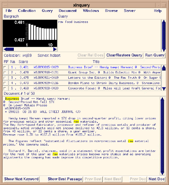
Figure 1. XINQUERY
Note that all major user-interface areas appear within a single window:
- In the upper left, a bar graph showing document-by-document scores for the retrieved documents (the
area is blank until a query is run). Each bar in the bar graph corresponds to a document title, and the length
of each bar corresponds to the relevance-score number to the left of the title.
- In the upper right, a text-entry area, into which an unstructured or structured query is entered.
- Just below those areas and across the window, an area in which a summary of the results (i.e., list of
retrieved documents, with numeric scores estimating their relevance) is displayed. This area is also used to
control relevance feedback: note the check boxes under the column heading "RF".
- Further down still and across the window, an area in which the text of one of the retrieved documents
may be displayed, with text matching the query highlighted. To display a document, the user double-clicks
either a document title or its bar in the bar graph.
In addition, the window displays a number of buttons, all of the instantaneous kind; the name of the
database currently being used; and some information about the search results.
But XINQUERY's user interface exhibits many deficiencies (not all visible from these screen shots). To
point out some of the more serious:
1. The actual numeric scores given for documents are virtually meaningless, even to experienced
INQUERY users. Relative scores shown by the heights of the bars are much more useful, but it is not easy
to see the close relationship between bars in the bar graph and documents in the results area.
2. The appearance of the entire UI in one window strongly suggests tight coupling between query
display and results; but results are not updated until the user explicitly runs a query. As a consequence, the
query and the results shown can easily be "out of sync".
3. The only indications of what variants are in use are incomplete, vaguely worded, and available only
through menu commands with unintuitive names.
4. Only one document can be viewed at a time, and not much of that document at a time, since much of
the window is occupied by other "widgets".
5. There is a "query history" mechanism to support refining queries, but only for the current
session: a user can save only individual queries.
6. Many error messages take the form of a beep when they occur: to find out what the problem is, the
user must open a special error-list window. Even then, many of the messages are nearly incomprehensible to
a non-programmer. The example we gave before, "eval_query "" 50 ""
inq_eval_query called with zero length query", is fairly typical.
7. It is not as obvious as it could be whether relevance feedback is in use.
We began work on a new front end for INQUERY early in 1996. The current version, WInquery, is
shown in Fig. 2; it is written in Visual Basic, and runs under Windows 95 and Windows NT.
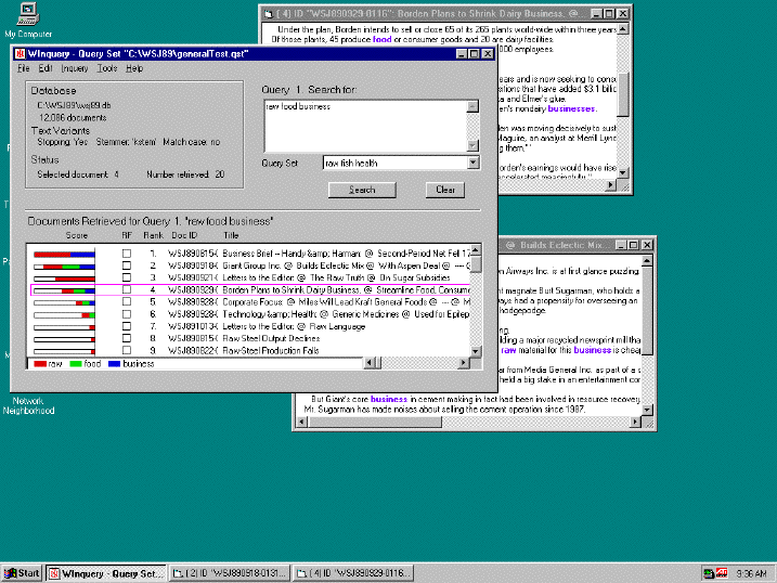
Figure 2. WInquery
The version of WInquery shown is similar to XINQUERY in many ways: it also supports single-
database-at-a-time searches, and much of the user interface is similar. However, WInquery addresses many
of XINQUERY's problems along the lines of the four-phase framework, though it follows the framework
less strictly than the THOMAS redesign. Changes to the XINQUERY trouble spots we listed are as
follows:
1. There is no separate bar graph area. Instead, the bar representing each document's score appears
horizontally, to the left of the document's title in the summary. The numeric scores are normally hidden, but
can be displayed if the user wants them.
2. To reduce the chances of a user incorrectly assuming results displayed correspond to the query
displayed in the query-text window, the summary is headed by the query whose results it contains. In
addition, query sequence numbers above the query-text window and with the summary-area heading
indicate whether the two correspond or not.
3. The status of stemming, stopping, and case sensitivity (which are features of the database and cannot
be changed) are shown underneath the database name at all times.
4. Several documents (currently a maximum of four) can be shown at once. Each appears in a separate
window, which can be as large or small as desired.
5. Files of queries can be opened, modified, and saved. The history of queries issued in a session can be
saved.
6. Error messages are straightforward, and they appear in modal windows when the error occurs. For
example, trying to run a query with an empty query-text field simply says "No query given. Type or
paste something into the query area and try again." (While this is certainly an improvement for most
first-time or intermittent users, note that an expert might find XINQUERY's default beep adequate and
might prefer not to be bothered with a modal window. This issue could be addressed in several ways, e.g.,
with a preference to choose between the two methods.)
7. If relevance feedback was used in evaluating a query, the caption above the summary area says so. If
relevance feedback is set for the query that will be evaluated if the "Search" button is pressed,
the button's label says "Search with RF".
Aside from addressing XINQUERY's deficiencies, WInquery has the unusual feature of breaking the
score bars into colored segments to form a "stacked histogram", where each segment shows the
contribution of a word in the query to the document's score, according to the legend shown at the bottom of
the window. This is reminiscent of Hearst's tilebars (Rao et al, 1995), but the resemblance is mostly
superficial. Tilebars provide information that stacked histograms omit, namely where words are used in
each document; stacked histograms give information tilebars omit, namely the documents' relative scores
and how much each word contributed to each document's score. (It might appear easy to infer a word's
contribution from a tilebar, but this is not so, since most systems assign different words very different
weights.) For example, the first document's high ranking came mostly from the word "raw",
with a smaller contribution from "business". A user can also change the mapping of words to
colors, assigning as many words as they want to a single color. This facility, like tilebars, comes under the
rubric of offering informative feedback.
A chart showing each user step and the corresponding system support can clarify a given system's
strengths and weaknesses, and so may be useful both in designing and evaluating systems. Table 2 is such a
chart for WInquery.
Table 2. Terminology |
Phase | System support |
| 1. Formulation: | |
| a.
Sources | Open menu command; current source is displayed at all times |
| b.
Fields | Embedded commands |
| c. Search for | Edit text box;
displayed at all times |
| d. Variants | No options; treatment is displayed at all
times; Show Parsed Query command |
| 2. Action | Start Search button and menu
command |
| 3. Review of Results | In Preferences command, set maximum items to
retrieve, whether to display numeric scores, whether to show colors for query-term contributions; can
change assignment of terms to colors; document display highlights matched words; can display several
documents at once |
| 4. Refinement | Relevance Feedback; support for query sets (user can
choose and re-issue or modify any query from a query set; the name of the current query set is displayed at
all times; query sets can be saved)
|
Finally, in a complex interface with many options, it might also be useful to break the system support
down according to what it does for each category of user -- for example, first-time, intermittent, or
frequent.
Conclusions
In summary, the four-phase framework focuses on:
1. Formulation:
a. Sources: specify which libraries and/or collections to search and the search range within
them.
b. Fields: each document in a collection may have multiple fields. Users specify which text
fields are to be searched. Searches may also be restricted by structured fields.
c. What to search for: users select or type in text, perhaps as one or more phrases. Users may
have control over stop lists (common words, single letters, etc.).
d. Variants: searches might allow user control over variant capitalization, stemmed versions,
partial matches, phonetic variants from soundex methods, and synonyms, abbreviations, broader, or
narrower terms from a thesaurus. In all cases, the user interface should make it clear which variants, if any,
are allowed.
2. Action: how does a search get initiated -- explicitly (e.g., with a button), or implicitly (e.g.,
when some aspect of the query is changed).
3. Review of results: conventional options are, for example, to specify result set size, layout,
sequencing (alphabetically, chronologically, relevance ranked, etc.), and contents (which parts and fields
are displayed). Less conventional interfaces might employ a wide variety of techniques, including many
based on information-visualization research.
4. Refinement: provide feedback on search results with informative messages and clustering
of results. For example, enable progressive querying, especially with relevance feedback; history keeping;
and extraction of results to files, perhaps for use in e-mail.
The sample Web interface we discussed above requires nothing more advanced than HTML tables and
forms, but in some cases, applying the framework successfully over the Web may require more powerful
tools such as Java. On the other hand, while we have thought mostly about text situations and both of our
sample interfaces are for full-text searching, we suspect our framework will prove appropriate for
multimedia as well as text.
Finding common ground will be difficult; not finding it would be tragic. While early adopters of
technology are willing to push ahead to overcome difficulties, the middle and late adopters will not be so
tolerant. In particular, the future of the World Wide Web as a universally acceptable tool may depend on
our ability to reduce the frustration and confusion of the masses of users, while enabling them to reliably
find what they need.
Appendix 1: Definitions
The following definitions may facilitate discussion.
Inadvertent activation, in human factors, means activating a user-interface feature without
intending to. In systems that use both single and double clicking extensively, a common mistake of new
users is to double click when they intend to single click: the result is inadvertent activation of the double-
click behavior.
An information need is the perceived need for information that leads to someone using an
information retrieval system in the first place.
Two terms are commonly used in the evaluation of information retrieval systems: precision and recall.
Precision is the ratio of the number of documents retrieved that "should" have been
retrieved -- i.e., the number of retrieved documents that were really relevant to the query -- to the total
number of documents retrieved. Recall is the ratio of the number of relevant documents retrieved to
the number of relevant documents in the database. Each can vary from 0 to 1, and the higher the value, the
better.
Morris Hirsch (1996) has given an elegant statement of why these concepts are important:
If you use any text search system, you will soon encounter two language-related problems: (1)
low recall: multiple words are used for the same meaning, causing you to miss documents that are of
interest; (2) low precision: the same word is used for multiple meanings, causing you to find documents that
are not of interest.
Relevance feedback is the process of taking retrieved documents that have been determined to
be good examples of what the user wants, and using them to produce an improved query. Determining
which retrieved documents are good ones is normally done by the user (for example, clicking a
"Similar Pages" button in Infoseek).
Stemming means converting words to their presumed roots. For example, "blacker",
"blackest", and "blacks" may all be converted to "black".
Stop words are words that the system ignores, normally because they are assumed to be so
common as to carry little information useful for distinguishing relevant documents from non-relevant ones,
while burdening the system with much larger index files, data structures, and so on.
A controlled-vocabulary field in a database is one that accepts only words or other values from
a pre-defined list. The term "controlled vocabulary" can also be applied to entire systems.
Unstructured text or free text (as distinguished from structured text or text involving
controlled vocabulary) is text in which any word or sequence of words might appear, and no word is
"reserved" to carry some special meaning. For example, in a system in which "and"
is a Boolean operator, "cats and dogs" would be structured text; in a system in which it is not a
Boolean operator, the same series of words might be unstructured text. Unstructured text is often called
"natural language", but this can be extremely misleading: see What to
Search For for more details.
Appendix 2: Feedback from Web Search Tools for a Difficult Query
The query "and, or" is one a student of linguistics or logic looking for information about
conjunction and disjunction might conceivably give, but both words are often used as Boolean operators;
when they are not, they are often listed as stop words. For this query, as of early November 1996:
- Yahoo responds "Please use a non-empty search string.": surely more confusing than
helpful to almost any user.
- Excite responds "No query terms were found in index." This is more sensible, but
excessively technical and again confusing.
- Infoseek responds "Infoseek found no results for your search.": slightly better yet, but still
confusing, since it gives no indication of why.
- Lycos says "You searched all sites for: 'and or'. You found 6001 relevant documents from a total
of 68,173,788 indexed Web pages: and". So Lycos actually searched for and found documents, but its
response is still confusing because it apparently ignored the "or".
- Open Text allows searching for "these words" or "this phrase". Searching for
words, it says "Your search would have resulted in exactly 35,348,185 matches on the Open Text
Index. Please refine your search." Searching for a phrase, it finds thousands of matches.
- WebCrawler responds clearly with "No documents matching 'and, or'".
- Alta Vista's Simple mode makes clear what it did by saying (the numbers are word counts)
"Ignored : or: 46370646; and: 223696255. No documents match the query."
- Alta Vista's Advanced mode (in which "and" and "or" are treated as operators)
says "Syntax error(bad query)": a rather technical statement, but probably justified for a mode
that is labelled "advanced".
Removing the comma between "and" and "or" had no effect in any case.
Appendix 3: Results of a Survey on Terminology Preferences
We did a survey on "Terminology Preferences for Text-Searching Programs". All of the
subjects were adult, native speakers of English with at least a high-school education. Of the 16 subjects, 7
were male and 9 female. Every subject had at least a little experience using computers, but several had
absolutely no experience with text searching. On the other end of the scale, none was an expert on
computers in general or an expert text searcher.
We showed subjects a "sample search page" that was actually a screen shot of an earlier
version of the redesign of THOMAS (Case Study 1, above), but with the labels "Sources",
"Fields", "Variants", "Action", and "Search" respectively
replaced by "Term 1" thru "Term 5". For each of these, we explained the concept
and asked the subjects for their preference. We gave the subjects a list of possibilities, but encouraged them
to choose a term of their own or even nothing at all (i.e., leave that label blank).
Below are the questions and the subjects' preferences. No number following a choice means no one
preferred it. "(S)" denotes choices suggested by the subjects; the other choices were those we
provided. To avoid ambiguity, terms containing nonalphabetic characters appear in quotes.
Term 1 (Sources)
Universe: 2 Databases: 5 Scope:
1 Sources: 7 (S) "Search what?": 1
Term 2 (Fields)
Fields: 9 Attributes: 3 Filters Limits:
3 Restrictions: 1 (S)
Term 3 (Variants)
Text variants: 1 Text matching: 3 Text matching
options: 3 Variants: 3 Text handling: 1 Equivalents:
4 (S)"Note:" : 1
Term 4 (Action)
Initiation: 1 Start-up Query: 1 Submit:
1 Run: 3 Action: 6 (S) [leave the box empty]: 4
Term 5 (Search)
Search: 6 Start Search: 7 Run Run Query:
2 (S) Go: 1
Acknowledgements
The authors wish to thank James Allan, Dave Aronow, Bill Berry, Pat Billingsley, Morris Hirsch, Leah
Larkey, Gary Marchionini, and Catherine Plaisant for their many helpful comments, and Bryan Slavin for
assistance in re-designing and implementing the THOMAS web site for Case Study 1. In addition, Pat
Billingsley's assistance in designing and running the terminology survey was invaluable.
References
ACM. Proc. ACM SIGIR Conferences (annual).
Ahlberg, Chris, and Shneiderman, Ben (1994). Visual Information Seeking: Tight coupling of dynamic
query filters with starfield displays. Proc. ACM CHI94 Conference, pp. 313-317 + color plates.
Baecker, R., Grudin, J., Buxton, W., and Greenberg, S. (eds) (1995). Readings in Human-Computer
Interaction: Towards the Year 2000. Morgan-Kaufman Publishers, Los Altos, CA.
Buxton, W. (1989). On the Road to Brighton. SIGCHI Bulletin 20, 4, pp. 16-17.
Callan, J.P., Lu, Z., and Croft, W.B. (1995). Searching Distributed Collections with Inference
Networks. Proc. 18th Annual Int. Conference on Research and Development in Information Retrieval
(SIGIR 95), pp. 21-28.
Croft, W. Bruce, Cook, Robert, and Wilder, Dean (1995). Providing government information on the
Internet: Experiences with THOMAS. Proc. Digital Libraries 95 Conference, ACM, New York.
Also available
here.
Doan, Khoa, Plaisant, Catherine, and Shneiderman, Ben (1996). Query Previews in Networked
Information Systems. Proc. Third Forum on Research and Technology Advances in Digital Libraries,
ADL '96, IEEE CS Press, pp. 120-129. Also available as
TR 95-
16.
Flynn, Laurie (1995). Making searches easier in the web's sea of data. New York Times (2
October 1995).
Hatlestad, Luc (1996). Internet search not over yet. Infoworld 18,39 (23 September 1996).
Hemmje, M., Kunkel, C., and Willett, A. (1994). LyberWorld - A Visualization User Interface
Supporting Fulltext Retrieval. Croft, W.B. and van Rijsbergen, C.J. (eds), Proc. 17th Annual Int.
Conference on Research and Development in Information Retrieval (SIGIR 94), Springer Verlag, pp.
249-257.
Hirsch, Morris. Private communication (1996).
Koenemann, Juergen, and Belkin, Nicholas (1996). A case for interaction: A study of interactive
information retrieval behavior and effectiveness. Proc. CHI 96 Human Factors in Computing Systems,
ACM Press, New York, NY, pp. 205-212.
Mahajan, Rohit, and Shneiderman, Ben (1996). Visual & textual consistency checking tools for
graphical user interfaces. University of Maryland Technical Report CS-TR-3639. Also available as
TR 96-
08.
Marchionini, Gary (1995). Information Seeking in Electronic Environments. Cambridge
University Press. A
description is available.
Oliver, S.H., and Berkebile, D.H. (1968). The Smithsonian Collection of Automobiles and
Motorcycles. Smithsonian Institution Press, Washington.
Preece, Jenny, Rogers, Yvonne, Sharp, Helen, Benyon, David, Holland, Simon, and Carey, Tom
(1994). Human-Computer Interaction. Addison-Wesley, Reading, MA.
Rao, Ramana, Pedersen, Jan, Hearst, Marti, Mackinlay, Jock, Card, Stuart, Masinter, Larry, Halvorsen,
Per-Kristian, and Robertson, George (1995). Rich Interaction in the Digital Library. CACM 38, 4,
pp. 29-39.
Shneiderman, Ben (1992). Designing the User Interface: Strategies for Effective Human-Computer
Interaction: Second Edition. Addison-Wesley, Reading, MA. A
description is available.
Shneiderman, Ben (1994). Dynamic queries for visual information seeking. IEEE Software 11,
6, pp. 70-77.
Somerson, Paul (1996). Web Coma. PC Computing (August 1996), 57.
Van House, Nancy, Butler, Mark, Ogle, Virginia, and Schiff, Lisa (1996). User-Centered Iterative
Design for Digital Libraries: The Cypress Experience.
D-Lib Magazine (February 1996).
Approved for release, January 14, 1997.
Copyright © 1997 Ben Shneiderman, Don Byrd, W. Bruce Croft


hdl:cnri.dlib/january97-shneiderman